
#derma
essentials
MFine Derma Essentials
An AI-personalized skincare product aimed to bridge the gap between dermatologist recommendations and personalized skincare product selection.
PROJECT DURATION
30 days
ROLE
Visual & UI Designer
RESPONSIBILITIES
Competitive Analysis, Wireframe & Visual Design
PROBLEM
Consumers in India struggle
to find skincare products that effectively address their unique concerns, often facing skepticism due to unclear ingredient lists and exaggerated claims.
GOAL
Design an AI-powered skincare experience that:
-
Helps users understand and choose suitable skincare solutions confidently
-
Improves trust through clarity and transparency
-
Reduces confusion around ingredients and claims
-
Bridges dermatologist guidance with product discovery
IMPACT
• CTR peak: 4.2%
(vs ~1.65% benchmark)
• Reached 1.2M+ users
through AI assessment
• Improved trust and engagement through clearer product education
Use the sections below to navigate through the case study quickly.
Design in Context.


Understanding the User.
MARKET RESEARCH
The skincare industry in India was valued at approximately USD 3 billion in 2023 and is projected to reach USD 8.49 billion by 2032, growing at a CAGR of 13.91% between
FY2025 and FY2032. (marketsandata.com)
The current consumer behavior looks like below:
Preference for Natural
and Organic Ingredients
Digital skin
solutions surge
Demand for Personalization

CURRENT TRENDS
Rise of D2C Brands: Direct-to-consumer (D2C) skincare brands are gaining traction, offering personalized experiences and exclusive product lines.
Preference for Natural & Science-Backed Products: Consumers seek a blend of Ayurvedic & clinically proven skincare formulations.
Integration of Technology: Brands are leveraging AI and machine learning
to provide customized skincare recommendations and virtual try-on features.
Holistic Wellness: There is an
increasing emphasis on holistic
beauty, integrating skincare with
overall health and wellness practices.
Digital Health & Virtual Consultations: Teledermatology & AI-driven
skincare assessments are
becoming mainstream.


INSIGHTS
%
60
of Indian consumers prefer personalized skincare over
generic solutions. (ET Retail)
85
of users trust dermatologist-recommended skincare more than influencer-endorsed
products. (Mintel India)
93
saw better skin with digital dermatology—
yet only 38% consult experts offline.
%
We decided to find out what other brands in the market were and how they were doing.
The best way to find our niche was to initiate a competitive analysis.
%
Competitive Analysis.
Minimalist, Traya, and Skinkraft were chosen as competitors for MFine Derma Essentials while cross-functionally collaborating with business and brand team, because they align with key aspects of personalized, science-backed skincare solutions in the Indian market. Here's a detailed competitor analysis of the same. However, customers face critical challenges:
1
Overwhelming Choices:
The sheer volume of available products confuses consumers, making it difficult to find suitable solutions.
2
Lack of Personalization:
Generic skincare solutions fail to address specific skin concerns effectively.
3
Routine Adherence:
Users struggle to maintain consistency in their skincare routines due to a lack of visible progress indicators.
4
Trust Issues:
Brands often make exaggerated claims, leaving consumers skeptical about product efficacy.

blends Ayurveda + science,
but is more hair-focused and
has limited skin personalization.
focuses on science-driven,
transparency, but lacks
personalization and consultation support.
is AI-driven with customization,
but lacks transparency &
expert consultation
MFine Derma Essentials competes by offering
scientifically backed skincare, free assessments, and
expert consultations, ensuring better personalization and trust.
The Challenge.
How can we design a seamless
digital experience that enhances user trust?
Encourages adherence to personalized skincare regimens, and provides real-time tracking of skin progress.

The best way to approach this challenge was to talk to actual users and consumers.
Interviewing them provided quite a valuable peek into the skin care space.
Findings from our interviews.
I collaborated with brand and marketing team when they conducted in-depth user interviews with 20 individuals across
various demographics, focusing on their skincare concerns, purchase behavior, and preferences for dermatological consultations.
"
I don’t trust
what’s in the bottle
-
72% of users ignored products with confusing ingredient lists
-
Many felt duped by "dermatologist-tested" claims with no proof
"
Why doesn’t skincare fit me?
"
I want expert help—but can’t get it
-
87% would consult a derm before buying… but only 38% ever had
-
93% saw better skin in 4-6 weeks with guided routines (like MFine’s)
-
68% hated one-size-fits-all products
-
61% actively hunted for solutions for acne/dryness/pigmentation
"
I give up too fast
-
54% quit routines when results didn’t show overnight
-
"Show me progress!" → Users begged for before/after tracking
"
Video calls > clinic visits
-
63% in smaller cities preferred virtual consults (no travel!)
-
But 32% worried: "Are online derms legit?"
A summary of USER NEEDS
NEED

The next step was determining how to translate our research and information into the development of our product.
Builds product trust and usability
Feels relevant, not mass-produced
Adds credibility and safety
Keeps users motivated to continue
Crucial for non-metro audiences
Removes guesswork, improves outcomes
WHY IT MATTERS
Clear, jargon-free product information
Personalized product recommendations
Access to real dermatological expertise
Progress visibility (photos, milestones)
Reliable virtual consultations
Simplified, guided routines

With the product services in place, I stepped in by setting the identity of our brand, its tone and values.
This would set the tone and visual identity of our brand across all channels of communication.
Setting up the identity.
OUR BRAND TONE & VALUES
Modern, Transparent, Science-backed, Personal.
Inspired by user trust, clinical credibility, and comfort.
/
Transparency
Clear, honest ingredient lists
and treatment timelines
/
AI-Powered Precision
Skincare that understands your skin as well as a dermatologist


/
Personalization
Tailored routines backed by dermatologist and AI insights
/
Clinical Credibility
Backed by science, real
dermatologists, and visual proof
IMAGERY STYLE & COLOR PSYCHOLOGY

/
Clean backgrounds,
human focus,
real skin textures
Building credibility
by featuring real dermatologists' faces
Ingredient texture and product close-ups
/
/
Organic and
natural extracts
/
Moving on in the process was to create a logo.
A logo is not just a visual symbol that represents a company or brand, its importance lies in creating
brand recognition, helping customers quickly identify a business, and foster brand loyalty and trust.
LOGO
The soft blue indicates soothing, clinical calmness and MFine’s core identity.

The divider line shows a transition from MFine (platform) to product range (Derma Essentials)
Rendered in uppercase geometric sans-serif
for authority, focus and high readability
The ‘A’ in both “DERMA” and “ESSENTIALS” is stylized as a triangle, subtly hinting at:balance, precision, and skin layering

It reflects clinical trust, visual sophistication, and minimalist clarity, aligning
with both MFine’s medical heritage and the soft, nurturing world of skincare.
#2297BE
CLINICAL
CALM
#FFEACE
Primary Color
Evokes clarity, clinical trust, and calm care.
BLOOM
To structure content while maintaining accessibility and visual clarity
Neutral
#F2962F
#9CD6EC
#38434E
NECTAR
Accent Color
CLINICAL
INK
Inspired by vitamin rich serums and radiant skin — creates warmth and vitality.
SKIN
#9CD6EC
MIST
Secondary Colors
Mist feels
dewy, and refreshing
Skin represents untouched skin,
warmth and neutral.
Bloom is
soft and
welcoming
A purposeful color system that feels clinical yet approachable—
balancing personal care with a break from harsh pharma aesthetics.
USAGE
PRIMARY: Call-to-action buttons, key navigation highlights, headings
SECONDARY: Backgrounds, cards, and section dividers for warm contrast.
ACCENT: Promo tags, interactive hover states, icons, highlights.
NEUTRAL: Primary text, borders, footer, secondary navigation.
Supporting: Infographics, tooltips, product info, illustration tints.
PACKAGING
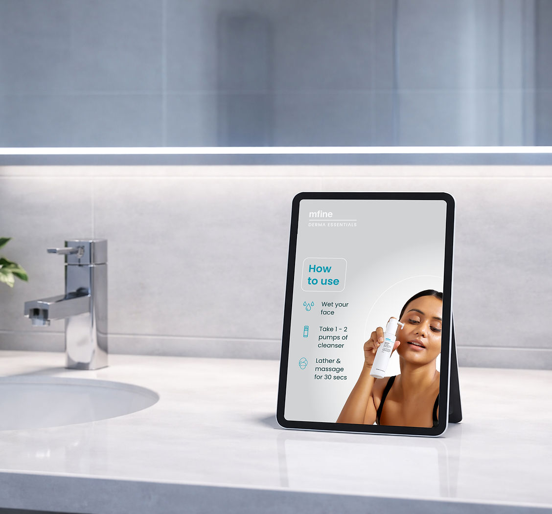
These packaging designs create a seamless transition from app experience to physical product, strengthening brand recall.

Dominant white background
for a clean, clinical aesthetic.
Teal accents from the logo applied
to highlight key product information.
Typography matches the UI system, maintaining brand consistency.
/
/
/
TYPEFACE

Typeface is a crucial element of MFine's Derma Essentials brand, ensuring consistency across all experiences and platforms.
It plays a pivotal role in establishing a clean, clinical, yet approachable feel.

DESIGN SYSTEM
To ensure a consistent, scalable interface, I used our own existing design system of MFine called the 'MFine DNA'.
ICON LIBRARY
For this project, the focus was on making the icons feel approachable and welcoming, so we opted for rounded corners and softer edges. This gave the icons a friendly, less clinical feel—perfect for a healthcare product designed to comfort users.
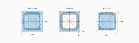

Ensuring proper padding and alignment so every icon felt clean and organized.
Specialities Icon (36px)

General Icon (24px)

Filled Icon (16px)
We use 1.5px line thickness for our icons, following the same guidelines outlined above. Since many of our icons have complex shapes, a thicker
2px stroke wouldn’t look right in every case. With the rise of high-density
displays, 1.5px icons stay crisp and easy to read, making sure the user
experience remains smooth and sharp on modern screens.
UI Components
The UI components using the color palette and iconography mentioned earlier, including elements like call-to-action buttons, checkboxes, search bars, cards, half-cards, popups, text fields, and dropdown menus.


Tabs: Highlighted with a thin teal underline for active states, maintaining a lightweight visual language.
Form Fields: Clean lines, high-contrast labels,
ample padding to ensure ease of use on touch devices.
Buttons:
-
Primary buttons use brand teal with white text, rounded corners for a friendly yet clinical look.
-
Secondary buttons use subtle grays with teal text for less prominent actions.
Cards:
Used for product tiles with generous
white space, featuring drop shadows
for separation without feeling heavy.

The design system helped in our creation of the app interface.
When we first launched the Page.


When we first launched the page, the idea was to keep the design clean, minimal and medical reflective we saw a CTR (Click-through-rate) of almost 9% on our homepage discovery banner which is quite high for healthcare apps.
LAUNCH - VERSION 01

After a month of launch,
we saw a decline in our homepage discovery banner.
We felt that the banner only conveyed a dermatologist consultation
and does not talk much about the brand and its products.
Also, we saw a decline in our landing page as well.
We received feedback that it felt
that the products are only for women.
VERSION 02
We decided to change the theme of the homepage banner by focusing more on displaying products and give more real estate to the banner
on our homepage discovery banner. The banner now includes a skin test, consultation, and content about skincare products.
A combination of all the services we were trying to promote.
Also, we decided to make the color theme more clinical, clean and less feminine and decided on changing our secondary and accent color.
#2297BE
#F2962F
#38434E
To structure content while maintaining accessibility
and visual clarity
Neutral
CLINICAL
CALM
#FFEACE
#9CD6EC
Primary Color
NECTAR
Accent Color
CLINICAL
INK
Evokes clarity, clinical trust, and calm care.
Inspired by vitamin rich serums and radiant skin — creates warmth and vitality.
BARE
MIST
Secondary Colors
Mist feels
dewy, and
refreshing
Bare represents
clean, untouched skin,
welcoming and neutral.
Now, the theme of the homepage banner focuses
more on displaying products and giving more real estate to the banner on our homepage.
The banner includes a skin test, consultation, and content about skincare products. A combination of all the services we were trying to promote.

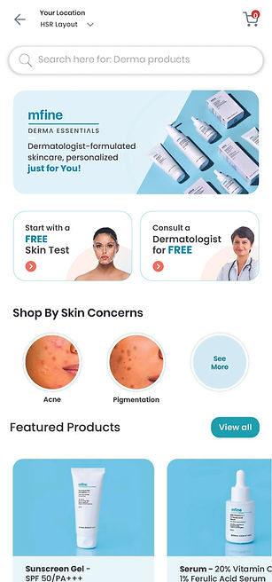
On our landing page, we displayed products in our hero banner and changed the color theme by making it look more medical by using shades of blue. Additionally, we are introducing a 'shop by skin concerns' section.
By 3 months into the launch, we were seeing a drop again. After receiving the data below from our Data Analytics team, me along with the product and UX team decided to rehaul the overall look and feel of the discovery homepage banner as well as the category listing page.
How many users Started Skin Anslysis and completed it from (Jan 16 to Mar 14)
Users Started SA : 8,454
Users Completed SA : 5,837

How many users takes SA and finished the consultation and post pd order
-
Most of the users dropped off when they saw the result page
-
Out of 11K+ users only 1708 users clicked on consult button
-
Out of this 1708, only 19 completed the flow and purchased the products


How many users directly searching and order the product

Problem assumption:
-
Trust matter may be missed in for consultation button
-
In the stage of Case Forward to Prescription, half of the users dropped off, maybe the consultation with doctor flow need to be changed or enhanced
-
We can improve the PDP (product listing page) page more informative and interactive.
-
The CLP (category listing page) could be more expressive with display of products and inclusion of human faces.
VERSION 03
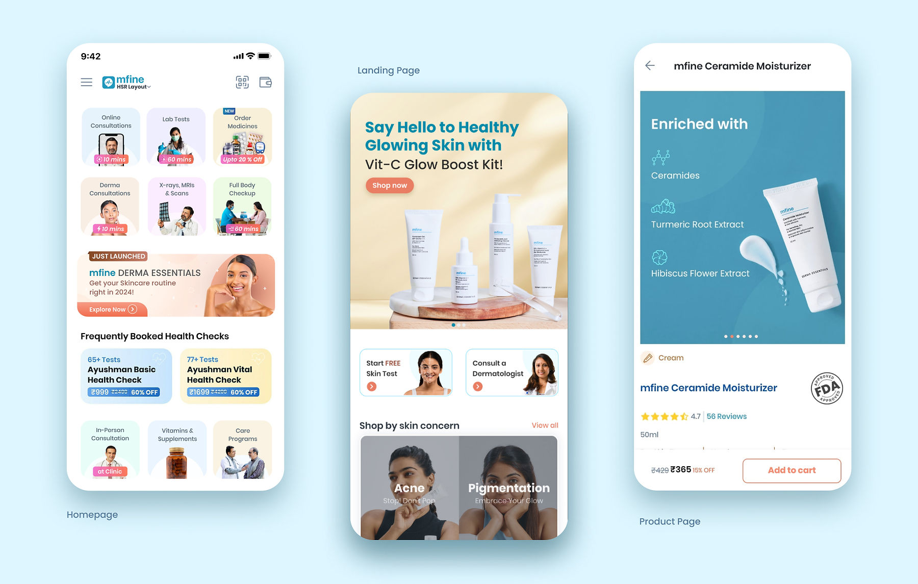

Category Listing Page

Product Description Page


Even though the engagement with Skin Test and Dermatologist Consultation
was high and users were buying the products, the CTRs and conversions
could not get as high as they were at the launch.
But our social media posts, performance ads and reels were doing
better and we were getting organic leads. So we decided to leverage that.

Social Media.
The Instagram posts discussed a combination of general beneficial skin care tips, while also
occasionally showcasing our products to increase interaction and engagement, rather than being overly salesy.
PERFORMANCE ADS:
The performance ad carousel showcased our
skincare products starting with addressing a
skin concern and lastly showing our consumers
to increase the credibility of our products,
Impact and Metrics.
TOP NAVIGATION BANNER : Placed primarily in the app's primary navigation zone, this banner was designed to capture attention and direct users into personalized skincare journeys.
The banner maintained steady impressions (~6K/week) and
delivered CTR between 2.3% and 3.5%, performing well above
the industry benchmark of ~1.5% for healthcare display ads.
Views
~6.2K per week
High visibility with
strong awareness
Clicks
~150 per week
Users actively explored
skincare offerings
CTR Range
2.3% - 3.5%
Visuals and
positioning resonated


DISCOVERY BANNER
Views
~6.1K per week
Campaigns achieved
high visibility
Clicks
~195 per week
Higher interaction
than static creatives
CTR Range
3.0% - 4.2%
Up to 2.5× higher engagement
than the Indian healthcare average.
The banner achieved a CTR peak of 4.2%, nearly 2.5× higher than typical
Indian healthcare benchmarks (~1.65%) as per Meta Healthcare India,
validating the effectiveness of contextual, visually-led messaging.

SOCIAL MEDIA

Views
4.7M+
Reach
5.5M - 6M+
Interactions
24,000

Avg. Engagement Rate
0.4% - 0.5%
Profile Activity
43,000
Usage of AI & increasing Design Efficiency.
AI tools played a significant role in accelerating and refining the visual design process:
-
Adobe Firefly & Photoshop Generative Fill: Used to quickly create and iterate on product mockups, packaging textures, and background variations for UI screens.
-
ChatGPT and Deepseek: Assisted in drafting microcopy, button texts, and section titles, helping maintain consistent voice and tone throughout the app and marketing materials.
Outcome: Reduced the number of manual iterations, image editing and cut visual exploration time by ~40%, allowing more focus on strategic design decisions.
Accessibility & Inclusivity while designing the page.
Ensuring the design catered to diverse users was essential:
-
Contrast Ratios: All text and interactive elements were tested to meet WCAG AA standards for readability, especially for those with low vision.
-
Skin Tone Representation: Imagery included diverse skin types to avoid bias and reflect inclusivity in skincare.
-
Touch Targets: Buttons and interactive components designed with a minimum of 48x48dp size for easy interaction on mobile.
-
Typography: Chose fonts with clear letterforms to aid readability for neurodiverse users or those with dyslexia.
This commitment to accessibility fosters trust and usability for all users.
Beyond the measurable results, this project was a profound learning experience for me as a designer.
Final Reflection.
Designing MFine Derma Essentials was an opportunity to blend AI-driven personalization with science-backed skincare solutions and create a trust-first visual identity.
Through our design approach:
-
Banners outperformed industry benchmarks → achieving CTR peaks of 4.2% compared to the Indian healthcare average of ~1.65%.
-
Educational content drove organic traction → Instagram content like the “60-Second Cleansing Rule” gained 35K+ views, 61 saves, and strong audience engagement.
-
Clean, clinical aesthetics built credibility → making users more likely to explore personalized routines and product recommendations.
While the initiative’s lifecycle ended in 2024 due to broader business realignments, some of the aspects I learned were:
-
Personalization drives exploration
-
Educational content builds trust
-
Minimalism improves engagement
-
A cohesive design system that bridges digital and physical experiences is crucial.
-
Integrating AI into the workflow unlocked speed and creative exploration.
-
Small visual tweaks (like softening colors or simplifying labels) can greatly impact user comfort and trust.
-
I also gained a better understanding of balancing creativity with practicality—knowing when to simplify and when to add and subtract thoughtful details.
The experience strengthened my ability to design for impact, measure visual success, and translate insights into engaging user journeys — skills I will carry into every future project.
