
For a healthier
you...
But, First Me
'But, First Me' , a marketing campaign, is all about flipping the script on how women often take a backseat
when it comes to their health. Switching gears to 'Pehle Main' makes sure that women's healthcare becomes a priority.
PROJECT DURATION
ROLE
RESPONSIBILITIES
7 Days
UI Designer
Research, Competitive Analysis, User Interview, User Persona, Wireframe and Visual Design.
PROBLEM
Women postpone healthcare due to time, awareness, and trust barriers. Despite relevant services, MFine saw low engagement in women’s health—revealing the need for a more emotionally compelling, action-oriented value proposition.
GOAL
Design a campaign-led experience that:
• Motivates women (28–40) to prioritise health
• Bridges gaps in awareness + trust
• Improves conversion from free → paid services
IMPACT
-
38% Install → Sign-up conversion
(Identified 62% onboarding drop-off — key opportunity) -
9,948 Period Tracker transactions
Strong adoption of free tools -
90 Paid Health Program purchases
Revealed trust & value communication gap -
₹645 Avg revenue per paid transaction CPA ₹64.83 → profitable scaling potential
SCOPE
We focused on optimizing:
-
In-app landing page experience
-
Discovery of women-specific health tools
-
Conversion flows for free and paid features
Use the sections below to navigate through the case study quickly.
Design in Context.
Understanding the User.
TARGET GROUP
LIFESTAGE Working professionals
and stay-at-home moms


DEMOGRAPHICS
Urban women (28–40),
digitally active, juggling work
and family, but hesitant to
invest in their own health.
QUICK RESEARCH
Commencing user research, we delved into identifying services that could truly benefit women without hurting their pockets.
Whether it's virtual doctor consultations, health check-ups, or simply monitoring your menstrual cycle, we explored the spectrum.
Key questions that we wanted answers for, for our campaign
-
What challenges do women face when trying to access healthcare in digital space?
-
Have they used online health services? What made you trust (or distrust) them?
-
What emotional barriers prevent them from prioritizing their health?
-
What role does convenience, trust, and empathy play in their healthcare journey?
-
How much time are you willing to spend on a health platform? What frustrates you about it?
-
How often do you go for preventive health checks? What prevents you from doing so?
-
What kind of health content grabs your attention: articles, short tips, videos?
We started with user interviews involving women and here’s what stood out:
Trust Gap in Platforms
Time Starved
"I know I should do preventive checkups, but I keep putting it off because I'm too busy."
“I don’t feel confident booking from apps—how do I know it’s the right specialist? and "I don't know if online tests
are trustworthy."
Mental Load & Decision Fatigue
“It’s exhausting
to research what
tests I need or which doctor to see.”
Time Barrier
“I don’t have time
to scroll through
health articles. I need things personalized
and quick.”
Information Overload
"I lose interest if I
have to read a lot or
see too many offers."
Women-Centric
"I prefer seeing women doctors talking about women’s health."
Healthcare Feels Transactional
“Apps are great for buying meds but
don’t care about
me as a person.”
Fear of Cost
"Healthcare feels expensive. What if
it's too costly?"
LEARNINGS FROM THIS RESEARCH
-
Women are extremely busy: They know they should get health checkups but keep delaying because their schedules are packed.
-
They feel overwhelmed making health decisions: Figuring out what tests to take or which doctor to consult feels mentally tiring.
-
Trust is a big issue with online health apps: They are unsure if the doctors are good or if the tests are reliable.
-
Healthcare apps feel impersonal to them: Many feel like apps only want to sell products, not really care about their well-being.
-
They want fast, personalized information: They don’t have time to read long articles or go through endless offers — they prefer quick, tailored advice.
-
Too much information turns them away: If an app or website has too many choices or too much text, they lose interest quickly.
-
Cost is a big fear: Many hesitate to explore health services because they worry about hidden or high costs.
-
They prefer women-focused care: They feel more comfortable when the healthcare content is led by women or about women's specific needs.
Competitive Analysis.
There is currently a lack of comprehensive medical apps that encompass all essential services, such as doctor consultations, health screenings, in-clinic appointments, care programs, free assessments, and informative content in a unified platform.
Although we identified two apps that feature women's health pages, they still fall short of offering a holistic solution on a single page.

Pharmeasy provides all the lab tests done concerning women's health in their 'Women's Care' page
Apollo 24/7 does not have a
women-centric health page but provides lab tests and doctor consultations.
KEY FINDINGS FROM THE ANALYSIS
-
Emotional Connection is Missing: Both platforms approach healthcare like a "task" instead of building a human, empathetic relationship — especially for women.
-
Overwhelming Choices and Content: Users don’t have the time or patience to navigate complex options.
-
Low Personalization for Women: Services are generic; women-specific journeys are not well-defined.
-
Trust Building is Weak: Discounts are offered, but trust signals (testimonials, women doctors, expert endorsements) are not strongly highlighted.
-
Heavy focus on medicines and doctor consultations available but not highlighted emotionally, still feels transactional.
Persona.
Based on the data collected from our research and competitive analysis, we created a persona to understand emotional and practical pain points.
"I always strive to give the best attention to my family's needs, but want to lead a healthy lifestyle especially after having baby "
Madhavi
Age: 33
Family: Married, 1 child
Hometown: Bangalore
Education: Bachelor's Degree
Occupation: Graphic Designer
Tech Savviness: High (comfortable with smartphones and apps)
Lifestyle: Work-life balance challenges
Goals:
-
Take better care of her health
-
Access quick, reliable health resources
-
Simplify wellness decisions
Challenges:
-
Time scarcity (juggling work, family, personal life)
-
Overwhelmed by choices
-
Difficulty finding trustworthy, personalized healthcare content

We quickly created an empathy map from our findings to get a deeper understanding of our user base.
SAYS
-
I dont want information overload and the language should not be too technical
-
As English is not my primary language, the content should be easily understandable.
-
I need something that fits into my busy schedule.
-
Apps just want to sell me stuff, they don't care about me.
THINKS
-
I want a comprehensive platform for women's healthcare, offering both preventive and curative services, all in one accessible space.
-
I want the doctor consultations to be swift and easy.
-
Can I really trust these health apps to help me?
-
I don’t have time to dig through endless health content
-
Searching for a healthcare app that is easy-to-use
-
Skims health content quickly; avoids reading long articles.
-
Drops off apps if overwhelmed by choices or information.
-
Exploring healthcare apps for informative medical advice (not just Google)
DOES
FEELS
-
Eager about the incorporation of services such as AI-powered health assessments
-
Guilty for delaying her own health checkups.
-
Overwhelmed by information overload
-
Anxious about unexpected or high costs.
-
Relieved when content feels relatable
-
Skeptical and cautious about online healthcare.
After sensing a common pattern, we moved to defining a clear problem statement which we wanted to address.
The Problem Statement.
Urban women aged 28–40, who are digitally active and balancing professional and personal lives, often deprioritize their health due to time constraints, mental fatigue, lack of trust in online healthcare platforms, and perceived high costs.

Existing digital healthcare solutions primarily focus on transactions (e.g., buying medicines or booking tests) without building personalized, trust-based relationships. As a result, women feel unsupported emotionally, overwhelmed with information, and hesitant to invest time or money into preventive healthcare, despite having a genuine need.
Therefore, we needed to create a campaign that would:
01 /
Prioritize women's emotional and practical needs first ("But, First Me").
02 /
Offer affordable, trustworthy, and easy-to-navigate healthcare services.
03 /
Empower women to take small, actionable steps toward their health without feeling burdened.
The phrase "But, First Me" acknowledges this selflessness but gently encourages them to pause and prioritize their own health without guilt.
The Name.
Women, especially in the 28–40 age group (our target audience), are often natural caregivers — putting work, family, kids, elders, and even household responsibilities ahead of themselves.
With the product services in place, I stepped in by setting the identity of our brand, its tone and values.
This would set the tone and visual identity of our brand across all channels of communication.
Setting up the identity for the campaign.


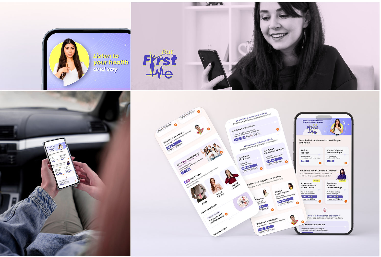
Few quick Wireframes.

The Page that went live.


Impact and Metrics.
This women's day in-app campaign aimed at engaging users, driving sign-ups, and increasing transactions for women's health-related services. Also, it sought to leverage the occasion to offer value-driven content and services while measuring its success through key engagement and conversion metrics.
Overall Reach
5.67 million users
Installs
17,874
Sign-Ups
6,800
Overall Engagement
17,410 interactions
Total Revenue
₹58,100
Conversion Rate (Install to Sign-up): 38%:
Indicates a relatively effective onboarding experience, but room for optimization.
Period Tracker Transactions: 9,948
Suggests a highly engaged user
base utilizing key app features.
Total Transactions: 90
The average revenue per transaction was ₹645 and a ₹64.83 CPA per signup
Lessons Learned.
✅ What worked well?
1. High campaign visibility with 5.67 million reach and 17,410 engagements.
2. Strong user acquisition with 17,874 installs and 6,800 sign-ups (38% conversion rate).
3. Free features (e.g., period tracker) saw high engagement, proving user interest.
❌ What didn't?
1. Revenue generation did not match engagement, indicating a gap in converting free users to paying customers.
2. High drop-off rate from install to sign-up (62%), highlighting potential friction in the onboarding process.
3. Only 90 premium transactions, suggesting the need for stronger value communication, pricing adjustments, or trust factors
As a designer, some of my improvement recommendations would be
-
Used progressive disclosure to reduce cognitive load.
-
Introduce guided walkthroughs to explain premium services.
-
Use A/B testing to optimize CTA placements for health packages.
-
Personalize recommendations based on user behavior.
-
Strengthen trust & conversion for health packages
-
Offer a free trial or discounted first purchase.
-
Display testimonials and expert endorsements.
-
Implement an intuitive pricing structure with clear benefits.

Beyond the measurable results, this project was a profound learning experience for me as a designer.
Final Reflection.
1. Empathy-driven messaging works better
2. Personalization improves engagement
3. Consistency builds familiarity: Following brand-aligned design principles while crafting a fresh, campaign-specific visual style created a seamless experience.
4. I learned to design with all perspectives in mind while working closely with marketing, business and content teams that taught me how to align multiple stakeholders without diluting the user experience.
5. Framing the campaign around self-prioritization resonated deeply with the audience, showing me the power of emotional storytelling in healthcare.